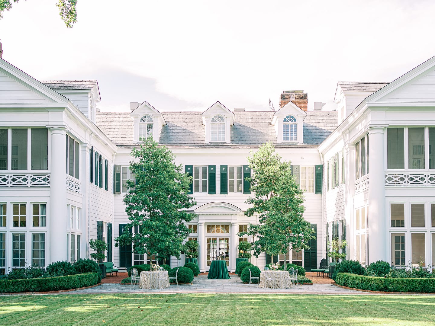
For this editorial, our team aimed to create for something bold and different. We loved the striking black and white floors of the venue, and looked to accent them with minimal colors. With the lush surrounding gardens of the property, we felt that “British racing green” was the perfect addition. Adding in florals with soft peach tones to complement the green made for a pleasing yet unexpected combination. We aspired to create a season-less editorial that showcased the beauty and style flexibility of the property’s spaces.
Styling this day was such a treat! After designing the initial tablescape plan, we worked with the photographer for the selected items for personal details. We shared an overall concept to the stationer, and she absolutely nailed the look for the fabulous suite. It was sophisticated with just the right amount of panache: gold brooch, silk tassels, metallic marbling, and velvet enclosure included. Pulling in contemporary details to contrast with the traditional, historic mansion created a really fresh, exciting vibe.
We hope that engaged couples see that they don’t have to be afraid of a bold color, or of blending modern with long-standing styles. Your day can still feel traditional and formal, even if you don’t have a white-on-white aesthetic or decorate with only traditional furnishings, florals, and place settings. Most importantly, make a statement by ensuring it looks and feels like you.
Beckon Events // CE Rental // Celestial Cakery // Directions USA // Duke Mansion // Flora // Grey & Cake // Latia Curtis Fine Art Beauty // Matt and Meredith Films // Rachel May Photography // White Magnolia Greenville
